EA Survey 2020: How People Get Involved in EA
EA Survey 2020: How EAs get involved in EA
Summary
Personal contacts (16.3%) remain the most common way people that people have first heard about EA, throughout the history of the movement, followed by 80,000 Hours (12.8%)
Among EAs who first got involved in EA in 2020, 17.1% first heard about EA through a personal contact and 16.5% from 80,000 Hours
Podcasts have increased in importance as a source of people first hearing about EA, accounting for 15.2% of people who got involved in 2020
More than half (50.7%) of respondents cited 80,000 Hours as important for them getting involved in EA
A much larger proportion of non-male respondents first heard about EA from a personal contact compared to male respondents
Significantly higher proportions of non-male respondents found personal contacts or local groups important for them getting involved in EA
Where do people first hear about EA?
1,912 (88%) respondents replied to the question, “Where did you first hear about Effective Altruism?”
Note: full size versions of graphs can be viewed by opening them in a new tab.
‘Personal Contact’ was the most selected option (16%) followed by 80,000 Hours (13%), and Book, article, or blog post (9%). In 2019, Book and Article or blog post were separate categories but summed to roughly 11%. Similarly, EA Global and EAGx were separate categories in 2019. The other options remained the same so we can analyze across years. Personal Contact, 80,000 Hours, Podcast, and Local or University Group had an increased share of responses from 2019 (ranging from 1.6% to 3.2% increases). Book, Article, or Blog, LessWrong, Slate Star Codex (SSC), GiveWell, and I don’t remember had a decreased percentage of responses (-1.4% to −1.9%). All remaining categories had a <1% change from 2019. Some of the underlying causes of these shifts in replies will be discussed below.
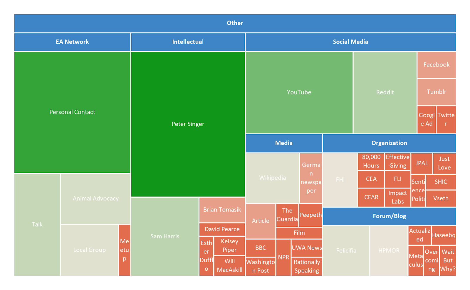
Where People First Hear of EA: Other
Of the 167 Other replies, 40% were categorized as fitting into an existing category.
About 26% of these reported first hearing about EA from a personal contact, an EA talk/conference, a local group, or through animal advocacy work. A further 26% mentioned a public intellectual or blogger, the majority of which were Peter Singer (28) and Sam Harris (9). Roughly 20% mentioned hearing about EA from social media. Of the 17 responses (10%) which referenced YouTube, 9 mentioned French channels called Mr. Phi and Science4All and 2 mentioned a Polish channel called Everyday Hero. A further 10% referenced some other form of media including Wikipedia, news articles, films, and podcasts. 15 people (9%) referenced an EA or EA-adjacent organization, and another 15 people mentioned a forum or blog.
Where People First Hear of EA: Further Details
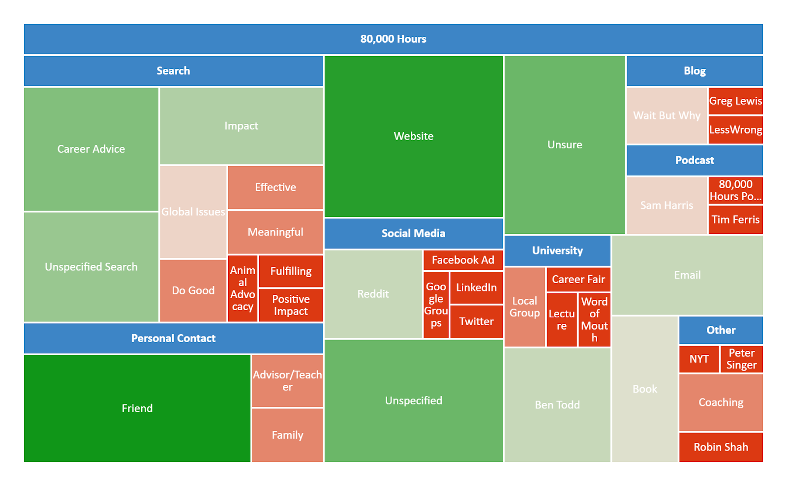
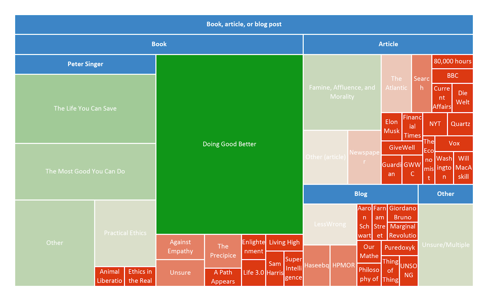
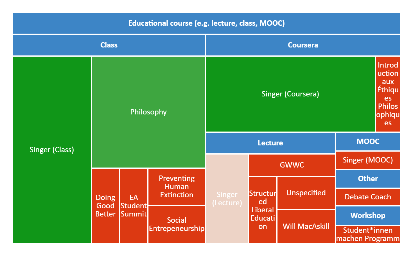
As last year, we also asked respondents to give more details about how they first heard about EA. We then classified these responses into discrete categories. We display these results divided by the category of fixed response that respondents selected (i.e. all the open comment further explanations provided by those who indicated that they first heard about EA from 80,000 Hours). We provide mosaic plots showing the proportion of responses within each superordinate category with the largest number of responses, and include bar charts for the categories with lower numbers of responses in the appendix.
Where People First Hear of EA: Changes Over Time
Using information on when people first got into EA, we can examine differences in where people first hear about EA across more or less recent cohorts of EAs. Of course, it is important to bear in mind that this does not necessarily represent changes in where people hear about EA across time, since people in earlier cohorts who heard about EA from different sources may have dropped out of EA (or the EA Survey sample) at different rates. In the future, we may conduct more analyses combining data across cohorts across years to examine this.
Looking at differences in where people reported first hearing about EA across different cohorts within our survey, we observe similar and continuing trends to those in previous years of the survey.
Personal contacts (17.1%) and 80,000 Hours (16.5%) continue to account for the largest share of people first hearing about EA (looking at those who first got involved in 2020). Overall, this means that over a third of EAs getting involved in 2020 first heard of EA from one of these sources.
We also observe that podcasts have increased in importance significantly, accounting for 15.2% of EAs who got involved in 2020 (in the qualitative data, 59% of these were attributed to Sam Harris).
What factors are important for getting involved?
We asked about what factors “were important for [them] getting involved in EA”, allowing respondents to select multiple options. On average respondents selected around 3 options (median 3, mean 3.3).
This year more than half (50.1%) of respondents reported that 80,000 Hours were important for them getting involved. Personal contacts (35.4%) and GiveWell (34.8%) were the next most commonly selected categories.
The broader results below show that a wide variety of other factors were also important for large numbers of respondents.
Changes in What is Important for Getting Involved in EA Over Time
Note that since this was a question where people could select multiple options, the percentages here will sum to more than 100%. Moreover, as we noted last year, the number of factors people select as important varies systematically across cohorts (as we can see below, the very newest EAs select fewer factors overall).
We can see that 80,000 Hours is disproportionately important relative to other factors, for EAs who have gotten involved since 2015.
Differences Between Groups
We examined differences in the numbers reporting that they first heard about EA from different sources across different groups (split by gender, race and level of engagement). It is important to note that these analyses don’t control for other factors. For example, if more people heard about EA from a source in more recent years, then we would expect the EAs coming from this source to be lower engagement overall. In later analyses we will try to control for these factors. Nevertheless, these figures may be of interest regardless, as they tell us straightforwardly what proportion of different groups have come from particular sources historically.
First Hearing About EA
Engagement
Most differences are not significant. However, we observe that significantly more highly engaged EAs report first hearing about EA from TED talks, while significantly more lower engagement EAs first heard about EA from podcasts or SlateStarCodex. As noted above, such differences could be confounded by other factors.
It is also worth attending to which sources accounted for higher numbers of highly engaged EAs overall. As we can see, irrespective of differences in proportions of highly engaged recruited, because some routes recruit significantly more EAs overall, these account for substantially greater numbers of more engaged EAs in total.
As our measure of engagement was a 1-5 scale, rather than binary, we also include a plot showing the proportions within each level of the scale below. The standard error and confidence intervals are still centred around the percentages in level 4-5, however.
Gender
We observe a large, significant difference in the proportion of men/women first hearing about EA from personal contacts, with a larger percentage of female respondents first hearing about EA from personal contacts.
Race
We compared responses for respondents who only selected ‘white’ versus those who selected any of the other categories (even if they also selected ‘white’ as a category). The only significant difference was for the category book, article or blog post.
Getting Involved
We also explored differences in terms of which factors were selected as important for getting involved in EA across the same groups as above. Each graph shows the percentages of respondents within each group selecting each factor as important (e.g. 0.2 = 20%).
Engagement
We observe significantly higher proportions of more engaged EAs selecting local groups, personal contact, the online EA community, books and EA Global and EAGx as important.
“Personal Contact” and “Group” stand out as particularly important for those who are most highly engaged.
Gender
Significantly higher percentages of non-male respondents indicated personal contacts or local groups to be important for their getting involved in EA. Conversely, significantly lower percentages of non-male respondents indicated that LessWrong was important for their getting involved.
Race
We observe that Giving What We Can was selected by a significantly lower proportion of respondents who selected any category other than (only) white.
Predicting differences in engagement
As noted, the analyses we prevent above which show differences in the engagement level of people who first heard about EA from different sources, don’t account for possible confounding differences. For example, as people who heard about EA more recently tend to be less engaged, we would expect people who first heard about EA from sources which recruited more EAs more recently, to appear less engaged on average. We will explore predictors of engagement in more detail in the dedicated Engagement post later in this series, which will aim to control for some of these differences.
Sampling/Referrer Adjustment
This year, as a robustness check, we include an analysis looking at how the results change if we exclude those respondents who were referred to the survey via a link from 80,000 Hours. (We previously discussed the issue of sampling from different referrers here) We focus on 80,000 Hours, because this year they were the single largest referrer of respondents to the survey, though they still only account for a minority (25%) of respondents overall, and because they represent one of the most commonly selected categories. One might wonder whether the high number of people being referred to the EA Survey from 80,000 Hours is artificially inflating respondents selecting 80,000 Hours.
To examine this, we looked at the results for where people first hear about EA and what helped them to get involved in EA excluding all respondents who were referred to the survey from 80,000 Hours. Clearly excluding every participant who was referred to the EA Survey from 80,000 Hours represents an extreme over-correction, as we would expect respondents who first heard about EA from or got more involved due to a given source, to be more likely to also hear about the EA Survey from that source.
This reduces the proportion of respondents indicating that they first heard about EA from 80,000 Hours from 12.8% to around 8%, roughly in line with the results from last year. Similarly, excluding every respondent referred from 80,000 reduces the percentage of respondents selecting 80,000 Hours as important for getting them involved quite dramatically, down to around 45%, while still leaving 80K substantially the most commonly selected category. These are significant changes in the results, but suggests that 80,000 Hours remain the top and second-most commonly selected categories for the getting involved and first heard questions respectively, even when excluding all respondents referred from 80,000 Hours directly.
Appendix
Further details about where people first hear about EA
Credits
The annual EA Survey is a project of Rethink Priorities. This post was written by David Moss, Jacob Schmiess and David Reinstein. Thanks to Peter Hurford, Neil Dullaghan, Jason Schukraft, David Bernard, Dominika Krupocin, Ben Todd and Howie Lempel for comments.
We would also like to express our appreciation to the Centre for Effective Altruism for supporting our work. Thanks also to everyone who took and shared the survey.
If you like our work, please consider subscribing to our newsletter. You can see all our work to date here.
- 80,000 Hours has been putting much more resources into growing our audience by (27 Feb 2023 10:21 UTC; 178 points)
- Introducing Effective Self-Help by (6 Jan 2022 13:11 UTC; 111 points)
- How to kick-start 10 university groups in 6 months by (9 Jun 2022 17:47 UTC; 110 points)
- EA Survey 2024: How People Get Involved in EA by (24 Mar 2025 12:38 UTC; 87 points)
- National EA groups shouldn’t focus on city groups by (5 Jun 2023 16:01 UTC; 69 points)
- Creating Individual Connections via the Forum by (30 Nov 2021 22:48 UTC; 67 points)
- 80,000 Hours is hiring! by (20 Jan 2022 16:12 UTC; 59 points)
- 's comment on National EA groups shouldn’t focus on city groups by (6 Jun 2023 13:38 UTC; 50 points)
- 2022 Survey Results by (LessWrong; 8 Mar 2023 19:16 UTC; 48 points)
- EA Survey 2020: Engagement by (19 Aug 2021 15:14 UTC; 42 points)
- EA Survey 2020: Community Information by (16 Aug 2021 9:33 UTC; 41 points)
- Social Relationships: A Neglected Factor in Wellbeing by (11 Aug 2022 16:15 UTC; 32 points)
- 's comment on EA Meta Funding Landscape Report by (26 Apr 2024 20:35 UTC; 32 points)
- EA Updates for June 2021 by (28 May 2021 14:04 UTC; 25 points)
- 80,000 Hours is hiring writers! by (25 Apr 2022 13:19 UTC; 22 points)
- Open position: Head of Job Board at 80,000 Hours by (2 Feb 2022 15:00 UTC; 22 points)
- Introducing Effective Self-Help by (LessWrong; 12 Apr 2022 15:01 UTC; 19 points)
- 's comment on EA Survey 2019 Series: How EAs Get Involved in EA by (14 Jan 2022 22:18 UTC; 18 points)
- 80,000 Hours is hiring for a marketer by (4 Aug 2022 1:24 UTC; 15 points)
- Expression of interest for a writer at 80,000 Hours by (14 Mar 2022 14:45 UTC; 13 points)
- 80,000 Hours is hiring an operations specialist by (15 Mar 2022 15:13 UTC; 11 points)
- 's comment on EA Survey 2020: Demographics by (20 May 2021 7:26 UTC; 11 points)
- Expression of interest for a research assistant at 80,000 Hours by (3 Mar 2022 14:31 UTC; 10 points)
- 's comment on 80,000 Hours two-year review: 2021–2022 by (9 Mar 2023 11:23 UTC; 10 points)
- Expression of interest for a popular writing consultant at 80,000 Hours by (3 Mar 2022 14:33 UTC; 10 points)
- 's comment on EA is more than longtermism by (4 May 2022 18:14 UTC; 5 points)
- 's comment on EA Survey 2020: Demographics by (20 May 2021 10:45 UTC; 4 points)
- Street Outreach by (6 Jun 2022 13:40 UTC; 4 points)
- 's comment on Please Take the 2020 EA Survey by (26 May 2021 14:23 UTC; 3 points)
- 's comment on Is effective altruism growing? An update on the stock of funding vs. people by (2 Aug 2021 21:33 UTC; 2 points)
- 's comment on Announcing EA Survey 2022 by (7 Dec 2022 20:13 UTC; 1 point)
I fixed a bug that was causing this post to get underweighted by the frontpage algorithm, and have reset the date of posting to now, to correct for the period where it wouldn’t have showed up on the frontpage.
Thanks!
Hi! You might want to start putting these in a sequence, as Vaidehi and I have done: 2017, 2018, 2019
Thanks for the suggestion(s)! I was waiting for us to have more of the posts in the series out. But, now that there are only a couple left, I agree it’s time.
Is it possible to get the ‘importance for involvement’ for all the four options of Gender X Engagement? I’d like to understand whether the high engagement of people marked ‘personal contact’ or ‘group’ as important for their involvement could be partially explained by their gender, or something of this sort. Doing that with Race could also be interesting.
I think this is what you want?.
(R note: I haven’t figured out how to purrr:map list splits of the dataframe to ggplot so I can’t automate these easily yet)
Thanks, yea!
Going over this, I don’t see anything particularly interesting. It looks like the ratio of people being highly engaged to not highly engaged per each factor is about the same for males and females in almost all categories. Some of the slight differences that I could find:
Males who rated EAG as important were about twice as likely to be not highly engaged compared to non-males (though the error is high here).
The share of not highly engaged non-males which had ‘personal connection’ as an important factor for involvement was slightly higher than the male counterpart. This slightly reduces the gap between males and non-males when it comes to how important is ‘personal connection’ for involvement for people who are highly engaged.
[Epistemic status: just looked into this briefly out of curiosity, not an official EAS analysis]
When I looked at this briefly in a generalized mixed model, I didn’t find a significant interaction effect for gender * engagement * the specific factor people were evaluating (e.g. EAG or group etc.) which comports with your observation that there doesn’t seem to be anything particularly interesting going on in the contrast between male and non-male interaction with low/high engagement. (In contrast, there were significant fixed effects for the interaction between engagement and the specific factor and gender and the specific factor.) Looking at the specific ‘getting involved factors’ in the interaction effect, it was clear where the only one where there was much of a hint of any interaction with gender * engagement was personal contact, which was “borderline significant” (though I am loathe to read much into that).
Probably the simplest way to illustrate the specific thing you mentioned is with the following two plots: looking at both male and non-male respondents, we can see that highly engaged respondents are more likely to select EAG than less engaged respondents, but the pattern is similar for both male and non-male respondents.
IMO it is hard know what inference to draw from these comparisons.
Firstly, making multiple comparisons obviously raises the risk of a “false-positive” … a result that is merely due to chance/sampling.
Secondly, with ‘multiple hurdles’ it’s hard to know how to compare like for like....
--> But note that the involvement factors may be driving engagement itself, and doing so differently for males and females
Also note that females tend to be less engaged, although the differences are not extremely large. See GRAPHS HERE—that link is a preview of results we will put out in our forthcoming ‘Engagement’ post.
Thanks, looking forward for the full post :)
It looks like Sam Harris interviewed Will MacAskill this year. He also interviewed Will in 2016. How might we tell if the previous interview created a similar number of new EA-survey-takers, or if this year’s was particularly successful? The data from that year https://forum.effectivealtruism.org/posts/Cyuq6Yyp5bcpPfRuN/ea-survey-2017-series-how-do-people-get-into-ea doesn’t seem to include a “podcast” option.
We show changes in the proportion of respondents coming from each source across cohorts using this year’s data here.
You can see the increase in absolute numbers coming from Podcasts and the % of each cohorts coming from Podcasts below. Because some portion of each cohort drop out every year, this should give an inflated impression of the raw total coming from the most recent cohort (2020) compared to earlier cohorts though. Comparing raw totals across years is not straightforward, because sample size varies each year (and we sampled fewer people in 2020 than earlier years as discussed here and here and although we think we can estimate our sampling rate for engaged EAs quite well, we’re less certain about the true size of the more diffuse less engaged EA population (see here))- so the totals for ~2017 at the time were likely relatively higher.
Sorry, I neglected to say thank you for this previously!
Thanks!
Incidentally your comment just now prompted me to look at the cross-year cross-cohort data for this. Here we can see that in EAS 2019, there was a peak in podcast recruitment closer to 2016 (based on when people in EAS 2019 reported getting involved in EA). Comparing EAS 2019 to EAS 2020 data, we can see signs of dropoff among podcast recruits among those who joined ~2014-2017 (and we can also see the big spike in 2020).
These are most instructive when compared to the figures for other recruiters (since the percentage of a cohort recruited by a given source is inherently a share relative to other recruiters, i.e. if one percentage drops between EAS 2019 and EAS 2020 another’s has to go up).
Comparing personal contact recruits we can see steadier figures across EAS 2019 and EAS 2010, suggesting less dropoff. (Note that the figures for the earliest cohorts are very noisy since there are small numbers of respondents from those cohorts in these surveys).
Thanks for these very helpful insights! I thought the mosaic charts were particularly creative and visually insightful.
I have one minor statistical nit and one related question.
In cases where ‘only one significant difference was found’ (at a 95% c.i.), it could be worth noting that you have around 20 categories… so on average one spurious significant difference is to be expected! (If the difference is small.)
Also a question about how the significance test was carried out.σ(a−b)=√σ(a)2+σ(b)2≤σ(a)+σ(b) so for calling a difference significant at 95% it matters whether you a) check if the individual 95% confidence intervals overlap or b) check if the diff’d confidence interval noted above contains 0 (the usual approach). Which approach was used here? I ask because to my eye there might be a few more (weakly) significant results than were mentioned in the text.
Hi Oliver. Thanks for your question!
We actually just performed the same analyses as we did last year, so any references to significance are after applying the Bonferroni adjustment. We just decided to show the confidence intervals rather than just the binary significant/not significant markers this year, but of course different people have different views about which is better.